Introduction
A fitness studio’s website isn’t just a digital brochure—it’s a lead generation machine. In 2025, your potential clients judge your studio’s credibility and professionalism within the first few seconds of landing on your site. A strategically designed layout can boost conversions, improve user engagement, and drive online bookings. In this blog, we’ll break down the best website layouts for fitness studios that are designed to convert visitors into paying members.
1. Hero Section with Value Proposition & Lead Form
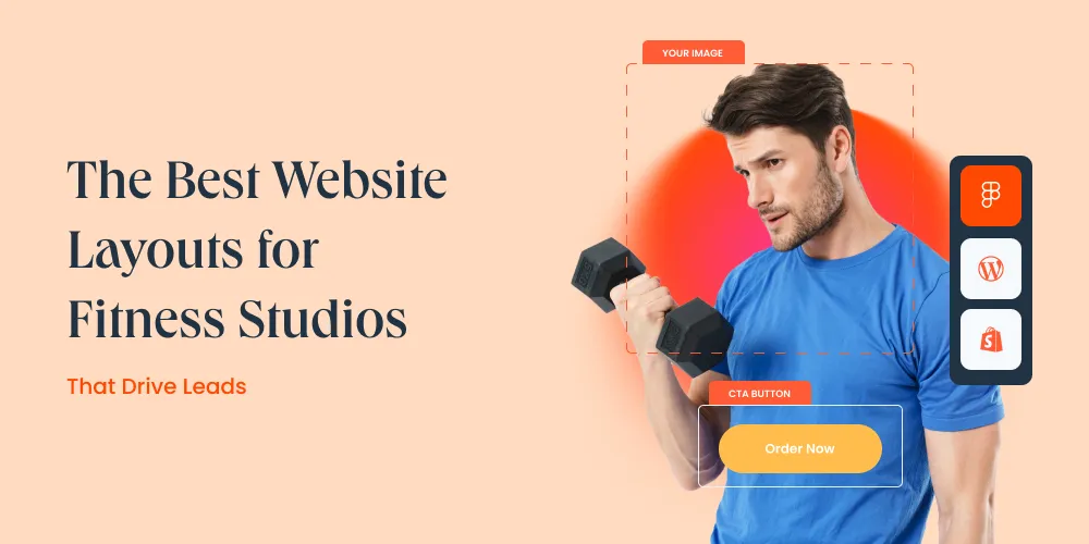
Firstly, your homepage should begin with a bold hero section that clearly communicates what your fitness studio offers and what sets it apart. Include:
- A compelling headline (e.g., ‘Transform Your Body in Just 12 Weeks’)
- A short subheading with a benefit (e.g., ‘Join our community-driven training programs’)
- A lead form or CTA (e.g., ‘Claim Your Free Trial’)
- Background video or image of your real studio in action
This layout sets the tone and drives immediate action.
2. Sticky Navigation with Booking CTA
Users should always have access to a ‘Book Now’ or ‘Get Started’ button. A sticky navigation bar ensures your most important actions are visible no matter how far the visitor scrolls. Include anchor links to key sections such as ‘Programs,’ ‘Trainers,’ ‘Pricing,’ and ‘Contact.’
3. Program Overview with Visual Tiles
Visual content plays a critical role in fitness marketing. Display your offerings (Yoga, HIIT, CrossFit, Personal Training) as image tiles or cards. Each card should include:
- Icon or photo
- Short description
- CTA: ‘Learn More’ or ‘Book Trial’
This layout makes it easy for visitors to understand what you offer at a glance.
4. Testimonials and Social Proof Slider
Nothing builds trust like success stories. Include a testimonial slider featuring client transformations, Google reviews, or short video clips. Display their name, fitness goal, and results. A strong testimonial section enhances your authority and helps prospects envision their own success.
5. Trainer Profiles with Booking Links
Your trainers are your brand ambassadors. Showcase their:
- Photos
- Specializations (e.g., Strength Coach, Zumba Instructor)
- Years of experience
- Certifications
- Booking or ‘Meet Your Coach’ CTA
Visitors often choose studios based on the vibe and expertise of the team.
6. Mobile-First Booking Section
With over 70% of traffic now on mobile, your booking layout should be:
- One-click to schedule trial sessions
- Integrated with calendars like Calendly or SimplyBook
- Auto-confirmation enabled
- Responsive design with large tap-friendly buttons
Avoid forcing users to call or fill out long forms.
7. Pricing Plans in Toggle Format
Presenting clear, simple pricing plans boosts trust. Use a pricing section with toggles for Monthly / Yearly / Pay-per-session views. Include:
- Plan name (e.g., Basic, Pro, Unlimited)
- Included features
- ‘Join Now’ CTA
- FAQs below the pricing to remove doubts
8. Location, Schedule & Contact Info in Footer
Many users scroll directly to the bottom to check location or schedule. Your footer should have:
- Google Maps embed
- Operating hours
- Click-to-call phone number
- WhatsApp chat icon
- Quick links to privacy policy, FAQs, and booking page
9. Lead Magnet Pop-Up or Banner
To maximize leads, use pop-ups or floating banners offering:
- Free trial pass
- Downloadable workout guide
- Sign up for weekly fitness tips
Trigger this based on scroll or exit intent. Make sure it’s not intrusive, especially on mobile.
10. Blog and Resource Section
An active blog helps with SEO and keeps users engaged. Cover topics like:
- ‘Nutrition Tips for Fat Loss’
- ‘Beginner’s Guide to Strength Training’
- ‘Top 10 Post-Workout Recovery Foods’
Add CTAs at the end of each post to push readers toward booking or newsletter signups.
Summary: Form Meets Function
To summarize, your fitness studio website layout should not only look appealing but also guide users through a smooth journey—from first impression to booking. By combining aesthetic design with functional strategy, you can create a high-converting online presence that grows your community and revenue.
Want a fitness website layout that delivers real results?
At SMPLY Studio, we design performance-focused websites for gyms, personal trainers, and fitness studios. We blend strategy, visuals, and tech to turn visits into bookings.
Start with a consultation and discover how SMPLY Studio can help you stand out online.


