Responsive Medical Websites
// Responsive Medical Websites
Mobile-First, Accessible & Conversion-Focused
What you gain:
Mobile discoverability:
search-aligned structure and medical SEO built for mobile-first indexing.
Conversion on small screens:
sticky Book / Call / WhatsApp CTAs and short, secure forms.
Usability for everyone:
WCAG 2.1 AA accessibility baked in.
Speed that keeps people engaged:
tuned for Core Web Vitals.
Trust signals where they matter:
credentials, affiliations, insurance info, and reviews (within platform rules).

// Features
What Makes Our Websites Convert
SEO Friendly Website (Editable CMS)
Edit pages & blogs in minutes
Local SEO Setup That Helps You Rank on Google
Rank better for local service searches
Lead Tracking & Conversion Analytics
Track calls, forms, and booking
Online Booking & Payments That Convert
Make booking fast and hassle-free
Fast, Mobile-First Websites Optimized for Core Web Vitals
Built for performance and SEO
Trust-Building Design That Turns Visitors Into Clients
Design that earns trust instantly
Ready to attract more patients and grow your practice?
Why responsive design is mission-critical in healthcare
Mobile first impressions:
Patients compare providers in seconds; a slow or cramped layout loses inquiries.
Mobile-first indexing:
Search engines primarily evaluate your mobile version; desktop-only polish won’t save a poor mobile UX.
Conversion happens on mobile:
Tap-to-call, WhatsApp chat, and simple booking forms remove friction.
Accessibility is non-negotiable:
Inclusive design helps real patients and signals quality.

You deserve a website that works as hard as you do.
// What a conversion ready
Responsive medical website looks like
Our design strategy focuses on clarity, credibility, and patient comfort. We incorporate:
-
Clear navigation with top tasks one tap away: Book, Call, Find a Location, Services.
-
Readable typography (base 16–18px), ample spacing, strong contrast, and scannable sections.
-
Plain-language content that answers who it’s for, what to expect, risks & recovery, and next steps.
-
Core Web Vitals targets: LCP < 2.5s, CLS < 0.1, INP < 200 ms on real devices.
-
Responsive images (WebP/AVIF), lazy-loading, preconnect to fonts/CDN, minimized blocking scripts.
-
One service/condition per page to avoid cannibalization.
-
Descriptive headings that map to patient intent; helpful internal links.
-
Structured data: MedicalOrganization / LocalBusiness (MedicalClinic), Physician, Service, FAQPage, BreadcrumbList.
-
Qualifications, memberships, hospital affiliations, sterilization protocols (where relevant).
-
Insurance and payment info near services; clear privacy & cookie notices.
-
Minimal PHI in forms; explicit consent language; SSL everywhere.
-
Sticky mobile CTAs: Book, Call, WhatsApp.
-
Short secure forms with clear confirmation and next steps (prep, parking, arrival).
-
Location finders and hours presented as tap-friendly cards.
Patient-first UX
Mobile-first performance
Search-ready structure
Trust & compliance
Conversion paths everywhere
Information Architecture (IA) you can copy
Home
positioning, specialties grid, outcomes language, trust band, primary CTAs
Specialties / Departments
dermatology, dentistry, ophthalmology, orthopedics, pediatrics, ENT, gynecology, physiotherapy, mental health, etc.
Conditions & Treatments
one page per topic with H2s: Symptoms → Diagnosis → Options → Risks & Recovery → When to Seek Care → FAQs
Doctors / Team
bios with credentials, languages, subspecialties, booking links
Locations
unique pages: NAP, map, hours, parking, accessibility details, photos
Telemedicine
eligibility, how-to join securely, troubleshooting
Patient Resources
forms, insurance, billing FAQs, preparation & aftercare guides
Blog / Insights
Q&A, comparisons, timelines, seasonal alerts
Contact / Book
tap-to-call, WhatsApp, secure request form
Tip: If you operate in multiple cities, create city pages (e.g., “Dermatologist in City”) and interlink from specialties and the footer. This is essential for local SEO.
Key features every responsive medical website should include
-
Keep primary nav short. Surface Book, Call, Locations, Services in one tap.
-
Use accordions/tabs for FAQs and secondary content to keep pages scannable.
-
Convert imagery to WebP/AVIF; size with srcset; lazy-load non-critical media.
-
Defer non-essential JS; inline critical CSS; preconnect to fonts/CDN; remove unused CSS/JS.
-
Monitor CWV via Search Console and real-user monitoring; fix regressions quickly.
-
Sticky CTAs; short forms (name, contact, service of interest, preferred time).
-
Tap-to-call and deep links for WhatsApp with prefilled messages.
-
Confirmation pages with next steps reduce no-shows.
-
Color contrast, keyboard nav, focus states, alt text, semantic headings.
-
Descriptive links (“Book Orthopedics consult”), captions/transcripts for video.
-
Test with mobile screen readers and keyboard-only navigation
-
Credentials, memberships, affiliations, awards; insurance & payment options.
-
Privacy policy, disclaimers, cookie banner (Accept/Reject/Manage).
-
Consistent NAP sitewide and in the footer.
-
Track form submits, call clicks, WhatsApp starts, booking events, and paths to conversion.
-
Use insights to move CTAs higher, simplify forms, and expand high-demand content.
Mobile navigation that reflects patient intent
Performance & Core Web Vitals
Conversion on mobile
Accessibility (WCAG 2.1 AA)
Trust & safety signals
Analytics & measurement
Content that ranks (and reduces phone volume)
High-value page types
Service pages:
candidacy, benefits, risks, recovery, aftercare, FAQs
Condition pages:
symptoms, diagnosis, options, when to seek care, FAQs
Doctor profiles:
credentials, languages, booking links above the fold
Location pages:
local landmarks, transit, parking, accessibility notes
Education blog:
comparisons (X vs Y), timelines, checklists, seasonal tips
Education blog:
comparisons (X vs Y), timelines, checklists, seasonal tips
Local SEO for mobile searchers
Google Business Profile:
complete categories/services, booking URL, photos, Q&A, weekly posts.
Citations:
consistent NAP across registries, associations, and quality directories.
City pages:
unique copy, embedded maps, parking/transit, “near [landmark]” details.
Reviews:
post-visit prompts (where allowed); encourage service + city mentions.
Internal links:
Home → Specialties → Conditions → Doctors → Locations → Book.
Security, privacy & accessibility—non-negotiables
TLS/SSL
sitewide; secure headers; hardened CMS with role-based access.
Form security:
honeypots, rate limiting, reCAPTCHA/Turnstile; PHI minimization.
Cookie consent
with Accept/Reject/Manage where required.
WCAG 2.1 AA
automated schedule; tested restores; dependency monitoring.
Uptime monitoring
and alerting across key templates (Home, Specialty, Condition, Location, Doctor).
(We implement best-practice technical patterns and follow your legal counsel’s guidance.)

// SEO checklist for
Responsive medical websites
One topic per URL (don’t combine multiple services on one page).
H1 matches the page focus; first 100 words confirm service and city if local.
H2/H3s mirror intent: symptoms, options, risks, recovery, FAQs.
Internal links between specialties, conditions, doctors, and locations.
Schema everywhere it makes sense (Organization/MedicalClinic, Physician, Service, FAQPage, BreadcrumbList).
Media SEO descriptive filenames, alt text, width/height set to prevent CLS.
XML sitemaps by content type; clean canonicals; redirect maps on redesign.
Measurement & continuous improvement
Primary conversions:
appointment requests, call clicks, WhatsApp starts, portal logins.
Assists:
time on service/condition pages, scroll depth, resource downloads.
Monthly actions:
move CTAs, shorten forms, add a high-demand service page, publish a city page, expand a FAQ based on search queries.
Roadmap:
one new service or condition page per month; quarterly performance/accessibility pass.

// Featured Website
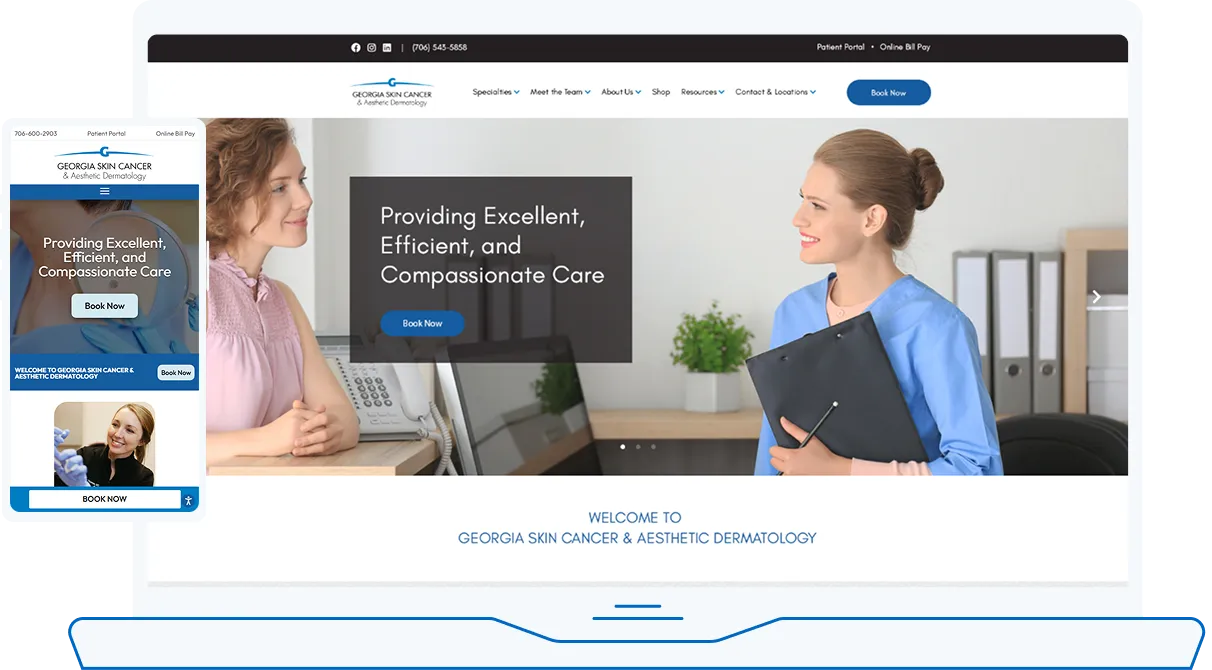
Skin Cancer & Aesthetic Dermatology

No Post Found.
Explore our portfolio:
// FAQs
Responsive Medical Websites
Why prioritize mobile-first for medical websites?
Most patients browse and book on phones. Mobile-first design makes content readable, CTAs obvious, and performance smooth where decisions happen.
How do Core Web Vitals affect patient conversions?
Slow or unstable pages increase bounce. Meeting LCP/CLS/INP targets correlates with better engagement and more appointment requests.
Can responsive sites handle online booking and WhatsApp?
Yes. We implement short, secure forms and deep-link WhatsApp/call actions so patients can book or ask a question instantly.
Will a responsive redesign hurt SEO?
Handled correctly—with redirects, preserved high-value content, improved speed, and structured data—redesigns typically improve rankings and conversions.
How do you ensure accessibility?
We design to WCAG 2.1 AA: color contrast, keyboard navigation, focus states, alt text, semantic headings, and descriptive links, then test on real devices.